TL;DR:
Are you ready to take your pitch game to the next level? Well, hold on to your concept art pens because we're about to dive into the world of pitch faux pas.
From generic images to too much of a good thing, we're calling out the top 5 mistakes screenwriters make when using concept art in their pitches or pitch decks. But don't worry, we'll also be giving you the solutions to help you avoid these pitfalls and make your story stand out like the cinematic masterpiece it is.

1 - Not using concept art at all
Omitting visual elements from your pitch is a costly error. It means missing a key chance to make an impact and be remembered. Many screenwriters underestimate the power of concept art in their pitches and fail to include it, missing out on the opportunity to showcase their vision and stand out from the competition. Concept art brings a script to life, making it more relatable and easier to grasp the vision. It's a powerful tool to showcase the world and characters of a story, and leave a lasting impression on industry professionals.
Imagine someone who has written a script for a high-concept science fiction film. The story is set in a distant future where humanity has colonized other planets and the main character is a rogue space explorer who uncovers a sinister conspiracy. Without any concept art, the script is just a collection of ideas on paper (or in a deck). It's hard for a producer to vividly envision the world and the characters, making it harder to understand the full potential of the story. But if the writer had included concept art that depicted the futuristic landscapes, the spaceship designs, and the characters, it would have given the pitch a visual dimension that would have made it much more compelling and memorable, increasing the chances of getting the script read and considered for production.
In short, a pitch without concept art is like a film without visuals. It's at best incomplete, and less likely to be considered for production. Don't let this mistake hinder your chance at success.

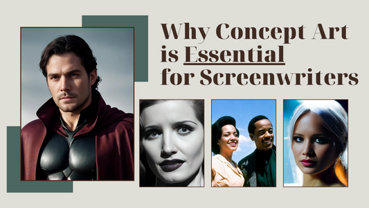
2 - Using screenshots or generic concept art
Equally as important is the quality of your art. It's imperative that the visual representation of your story is top-notch and captivating - because your story is itself meant to be top-notch and captivating. Using screenshots or generic concept art can actually harm your pitch, as it can give the impression that your story is not unique or well thought-out. It's a very poor reflection on you as a writer.
Generic or low-quality concept art can also make it difficult for industry professionals to understand your vision, and can give the impression that your story is derivative. That's on top of subpart art having the risk of detracting from your script. The visual element of your story is just as important as the written one, and investing in custom, high-quality photorealistic concept art is crucial in making your pitch stand out and effectively communicate your ideas.
Think of a screenwriter who is pitching a romantic comedy but uses generic stock art of couples in love. They could have brought custom concept art that accurately reflected the specific look and feel of their story. Bland stock photos, or re-using other people's work, can make your pitch seem less unique and less thought-out, making it ultimately less likely to be considered.

3 - Misaligning concept art with the story
Some writers are so eager to put something on screen that they use concept art that isn't directly related to their story, making it less effective in communicating key elements and themes. A failure to align concept art with your story can leave producers confused and uninterested. Just imagine a pitch for a gritty crime drama accompanied by whimsical, cartoonish illustrations. The disconnect between the visual elements and the story being told can cause a disconnect and make it difficult for industry professionals to understand the vision of the script.
Another example could be of a screenwriter who pitches a comedy about a group of friends starting a small business, but includes concept art of a city skyline and a fancy office building. The concept art does not align with the story, as the comedy's setting is a small town and the office is a makeshift workspace in a garage. This disconnect between concept art and story will make it harder for anyone to envision a project that will be costing millions.
Concept art should always be in symbiosis with your story and its themes, characters, and settings. It is meant to constantly emphasize the tone and atmosphere of your script. This is the best way to make a lasting impression on industry professionals and increase the chances of getting your script read and considered for production.

4 - Using too much concept art
Similarly, including too many images can create visual clutter, making it difficult for industry executives to focus on your story. It can also signal that the writer is not confident in their vision and is instead relying on concept art to carry the pitch.
Think of a writer who pitches a crime drama film that is full of complex characters and intense plot twists. They then include concept art for every single character, along with detailed illustrations of each location and scene. The pitch deck is cluttered with images and no one is able to focus on the key elements of the story, let alone understand what's going on. The excessive use of concept art actually detracts from the pitch and the writer fails to convey the tone and themes of their story effectively.
Be selective and strategic in the use of concept art, using only the most powerful and relevant images. Less is more when it comes to concept art in a pitch, as it allows producers to hone in on the most important parts of your vision.

5 - Not considering the audience
Creating concept art that only speaks to your own personal taste can quickly become problematic. It is important to consider your target audience and what would be most effective in attracting them to your story (not just you). Industry professionals, production companies and investors all have specific preferences and expectations. By failing to take these factors into account, you risk losing their interest before they even have a chance to hear you out. This is why it is important to think carefully about your audience when creating concept art for your pitch and to tailor it to their preferences. You could even make a different deck or concept art for each production company.
Imagine an abstract historical drama about the American civil rights movement, where the writer uses concept art that focuses on generic imagery and symbolism instead of recreating specific historical moments and figures key to their story. This approach may be visually appealing to the screenwriter, but it fails to effectively convey the true story and themes to the intended audience, making it less relatable and less likely to attract the attention of production companies and investors with an interest in that specific historical period.
Remember that you are pitching at specific production companies and to specific people, not to yourself.

Now you know what not to do when using concept art...but what about what you should do?
If you'd like to learn how to revolutionize your pitch, we recommend our FREE actionable book: "Concept Art for Screenwriters: How to Bring Your Story Pitch to Life And Win Over Producers".
We feature 11 detailed techniques to make your pitch stand out, including over 20 real-life examples of how successful TV shows and movies have used concept art to captivate buyers. Get the tools to change your game!

P.S.: All concept art featured in this article created by StoryVision.AI.